
Selected work / Carpentry & Construction
X45 Carpentry
Personal meaning. Precise geometry.
A custom logo and documented visual identity connecting the X45 name to carpentry and the founder's story.
RPM's role
Custom logo design, color and typography standards, and a documented brand identity with conceptual applications.
Logo Design · Visual Identity · Brand Guidelines
Project context
For X45 Carpentry, the X represents multiplication and the founder's faith in growth; 45 references the angle familiar in carpentry. RPM's task was to bring those meanings into a practical, recognizable identity.
The challenge
Meaning without literal illustration.
The symbol needed to connect personal story, faith and construction geometry without relying on obvious religious imagery. The name offered a strong starting point, but its parts needed to work together as a visual composition with consistent reproduction rules.
RPM's decision
Let the structure carry the story.
RPM explored the interaction of X, 4 and 5, integrating the X and 4 into a geometric reference to the 45-degree angle. A subtle cross-shaped detail in the lower part of the 4 connected the form to the founder's Christian faith without dominating the identity.
01 / Custom logo & symbol
Characters become a signature.
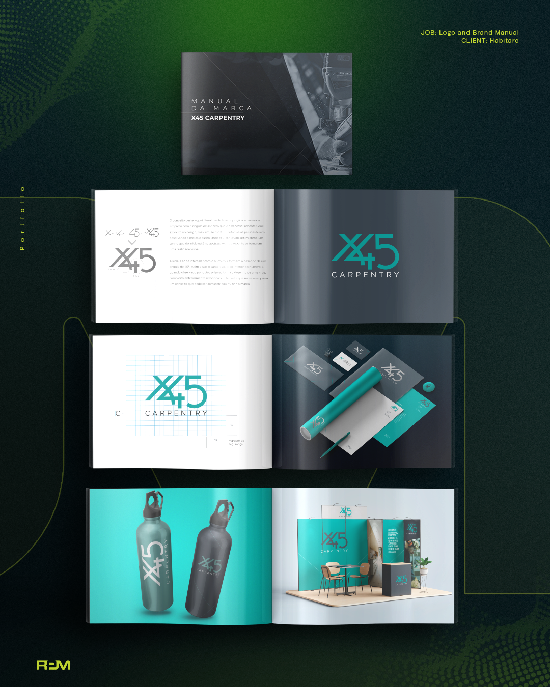
Overlapping X45 forms created a custom typographic symbol, paired with restrained CARPENTRY lettering to identify the business. Variations adapted the identity to different backgrounds while keeping its geometry recognizable.
The selected manual spreads show logo construction and variations alongside conceptual applications of the identity.
02 / Color & typography
A focused visual language.
Teal green was selected to express hope, balanced by dark gray for a professional, restrained presentation. Gotham Book supports the clean typography surrounding the geometric symbol. These specifications belong to X45's identity, not RPM's website theme.
- Teal green
- Pantone 3272 C
- Dark gray
- Pantone 432 C
- Typeface
- Gotham Book
03 / Brand guidelines
The construction is documented.
The 38-page manual establishes logo construction, proportions, clear space, official colors, typography and approved variations. Restrictions, incorrect uses, contrast and monochromatic guidance provide practical standards for reproducing the identity.
- Brand manual
- 38 pages
04 / Application concepts
Examples of how the identity could function.
Stationery, apparel, signage, social layouts, merchandise, exhibition materials and vehicle graphics were explored as application mockups. These are design demonstrations, not evidence that every physical item was produced or every digital application launched.
What changed
A concept, with standards for use.
RPM delivered a custom logo and documented visual identity with application examples. The result connects the story behind the name to repeatable design rules, without making business-performance claims.
The perspective
The story is in the construction.
The identity makes the name's meaning visible through geometry, while the manual keeps that meaning intact across future applications.