
Selected work / Healthcare, Physiotherapy & Wellness
Movva Clinic
An independent identity, built around movement.
Brand strategy, logo and visual direction for a healthcare business at a turning point.
RPM's role
Brand strategy, brand identity, logo design and visual direction.
Brand Strategy · Brand Identity · Logo Design · Visual Direction
Project context
Movva emerged during a business transition. Founder Cintia Graziele de Oliveira needed an independent identity that reflected her professional experience and existing patient relationships, while expressing a broader approach to care.
The challenge
Carry trust into a new identity.
The business needed to move beyond the perception of a conventional physiotherapy clinic without losing the human connection behind its reputation. Differentiation meant communicating more than a change of name: the identity had to connect personalized care with recovery, physical performance and longevity.
RPM's decision
Movement as the common thread.
RPM made movement the unifying concept across physiotherapy, Pilates, sports recovery, performance and longevity. Rather than centering the identity on one treatment, the direction connected different motivations: recovery for athletes, vitality for adults and mobility for older patients.
01 / Strategic positioning
A broader idea of care.
Movement was framed as part of living well, not only recovering from injury. This gave the clinic a shared language for its services while retaining the founder's emphasis on professional expertise and patient relationships.
The founder's interest in a scalable, potentially franchised future informed the brief. The identity was designed with future expansion in mind; franchise development or launch was not a delivered outcome.
02 / Brand identity & visual direction
Contemporary, without becoming impersonal.
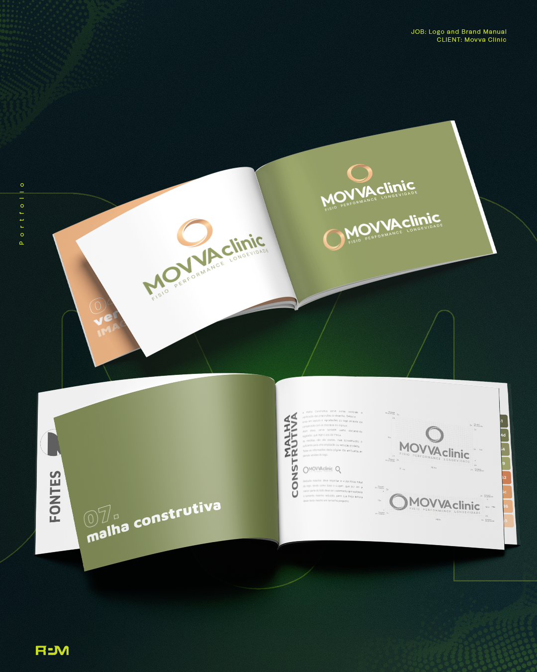
RPM translated movement, continuity, wellness and progress into a logo and visual direction. Clean composition and readable typography balanced a contemporary healthcare aesthetic with an approachable, human personality.
The source describes a palette centered on blue, green and orange, aligned with the client's preferences. The approved brand-manual board shows selected logo configurations and construction details, allowing the identity itself to be examined.
03 / Application system
Designed to travel across touchpoints.
Logo configurations, color direction and typography established a foundation for consistent use across different formats. Physical and digital application concepts explored how the identity could translate into patient-facing communication.
These are design applications, not proof of fabricated signs, architectural work, a developed website or a delivered social media system. Individual approved application visuals are not included here.
What changed
A strategic and visual foundation of its own.
Movva gained an independent identity connecting movement, recovery, performance and longevity. The tangible change is the brand direction and visual foundation, not an asserted business-growth or expansion result.
The perspective
Movement, expressed as an identity.
The logo and visual direction turn the clinic's broader care philosophy into a recognizable foundation for future communication.