
Selected work / Real Estate Development
Habitare Incorporadora
From brand direction to a repeatable identity.
A coordinated brand system for corporate, investor-facing and digital communication.
RPM's role
Brand strategy, visual identity, guidelines, corporate applications and social media design.
Brand Strategy · Visual Identity · Brand Guidelines · Corporate Design · Social Media Design
Project context
Habitare Incorporadora needed a credible, sophisticated identity suitable for real-estate development. Corporate documents, investor presentations and digital materials had to share a consistent visual language without becoming interchangeable pieces.
The challenge
One identity, across different conversations.
Habitare required a system that could accommodate business partners, investors and potential buyers while retaining the same professional positioning. The challenge was to make the brand recognizable and repeatable across print, digital and institutional formats, rather than delivering disconnected graphics.
RPM's decision
Establish the direction before the pieces.
RPM defined the strategic positioning and creative principles first, then translated them into a complete visual system and practical applications. Documentation was part of the delivery, so future teams could apply the identity without making each design decision again.
01 / Brand strategy
A shared foundation for communication.
Positioning, a central brand concept and creative direction established the foundation. Brand-perception and differentiation analysis considered the expectations of real-estate communication, including the need for a credible presentation to investors and buyers.
These were communication priorities, not measured improvements in investor confidence or buyer perception. The strategy guided visual decisions and institutional materials.
02 / Logo & visual system
More than one brand signature.
RPM developed the primary logo, secondary variations, symbol and horizontal and vertical configurations. A documented color and typography system supplied digital and print specifications, hierarchy and guidance for different communication contexts.
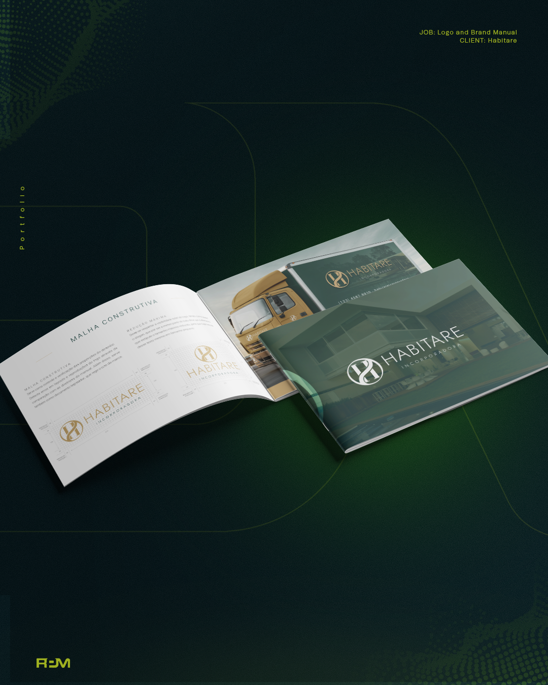
Supporting graphic elements, patterns and image direction extended the identity beyond the logo. The approved manual board shows selected brand signatures and construction details from that system.
03 / Corporate & social applications
Standards put to use.
Business cards, email signatures, corporate presentations and social profile designs translated the identity into everyday communication. RPM also created 15 branded social posts using consistent typography, color, imagery and layout.
The post collection and individual corporate layouts are documented deliverables in the source, but are not separately shown by the approved board. They are not presented here as published campaigns or proof of commercial performance.
- Branded social posts delivered
- 15
04 / Brand book & standards
A reference for the next application.
A complete brand book consolidated positioning, logo rules, correct and incorrect uses, color, typography and visual guidelines. Delivery included editable files, a logo kit for web and print, a PDF brand book and an organized professional asset package.
A website-based brand presentation brought the identity and applications together for review. This was a presentation format, not a claim that RPM built a commercial property website.
What changed
An identity that can be reused consistently.
The completed work connected strategy, visual standards, corporate applications and social design in one documented system. Its value is the reusable design foundation; changes in valuation, business growth or commercial perception are not claimed.
The perspective
The identity continues beyond the first design.
Guidelines and organized assets give future communications a common reference, keeping new applications connected to the same brand direction.